

Cultural Compact
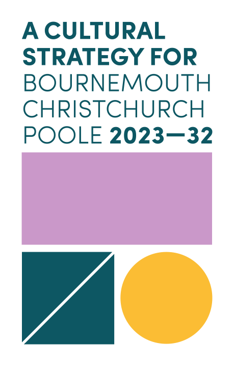
Visualising a cultural strategy for Bournemouth, Christchurch and Poole (BCP).
THE CLIENT
The Compact is made up of several different organisations who all have a stake in culture across BCP from cultural venues to educational and business organisations.
This project originally sat within BCP Council, who is still a key partner in the Compact, but now is hosted by Arts University Bournemouth. Together they are shaping a thriving and inclusive future for the creative sector in BCP.
THE CHALLENGE
The Compact required a standalone brand identity and visual toolkit that would formalise their dynamic plan and reflect the vibrancy of the vision. The look and feel needed to feel like something new - a new movement - fresh energy and creative enthusiasm. It needed to be dynamic and forward-thinking.
Beyond the core brand, the document itself needed to be digital only and extremely easy to digest, share and understand. Inclusion, diversity, equality and accessibility needed to be prioritised in both the creation and delivery of the strategy.
Application
Core branding, dynamic digital document and animation
Stand out
Brand identity
Further Links

THE SOLUTION
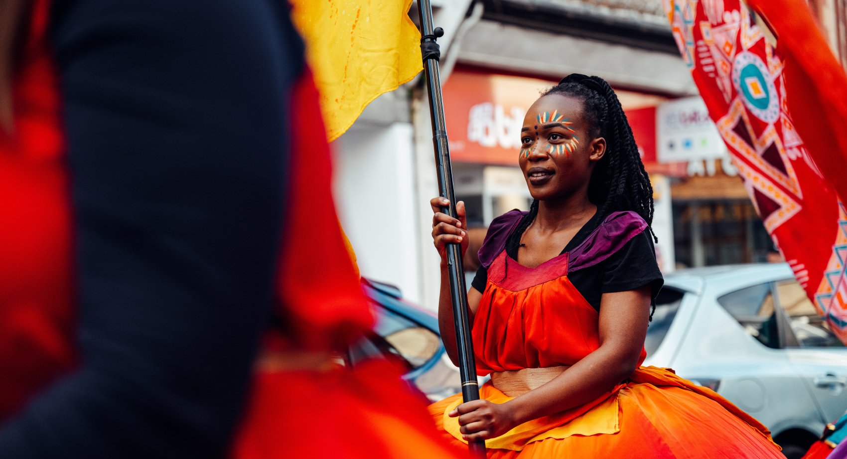
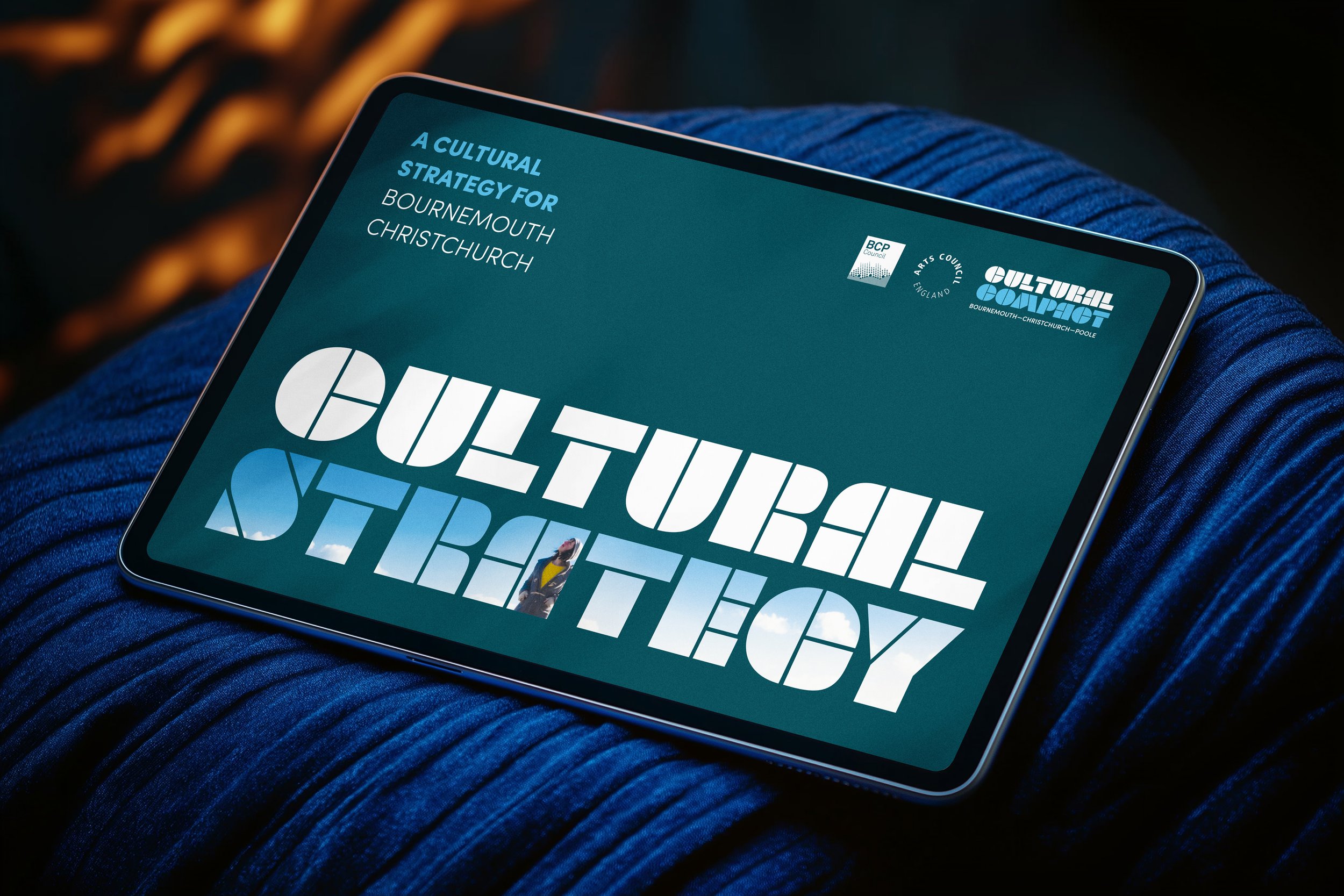
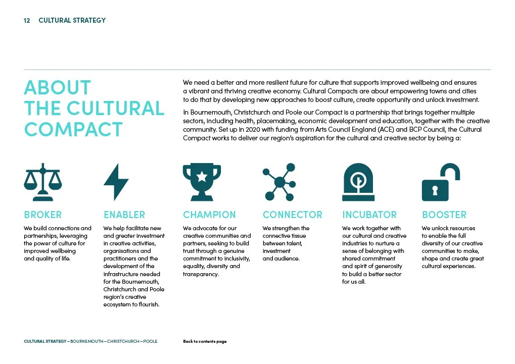
L&F created a stencil “building-block” brand identity, reflecting the coming together of skills, knowledge and experience. These block shapes could then expand out into a more visual, illustrative look and feel, branding the document subtly and making it feel more graphic. These shapes could also be used as cropping device for the many artist images.
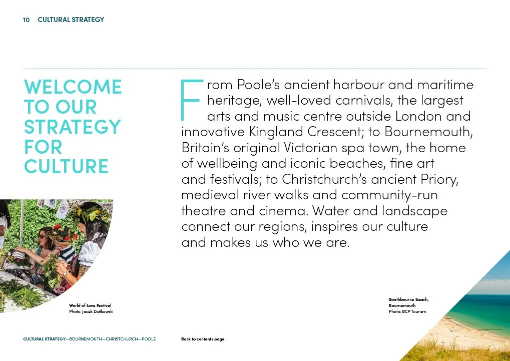
A broad colour palette was introduced, and a set of highly legible fonts implemented, to ensure clarity across all comms both in print and digitally.

WHAT WE DELIVERED
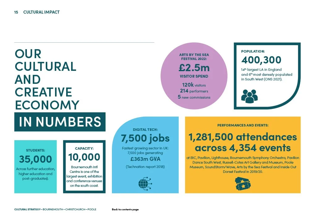
L&F delivered within six weeks a full brand identity and toolkit, along with a 43-page digital strategy document. The document had a strong sense of brand and playful framework, utilising a plethora of project imagery.
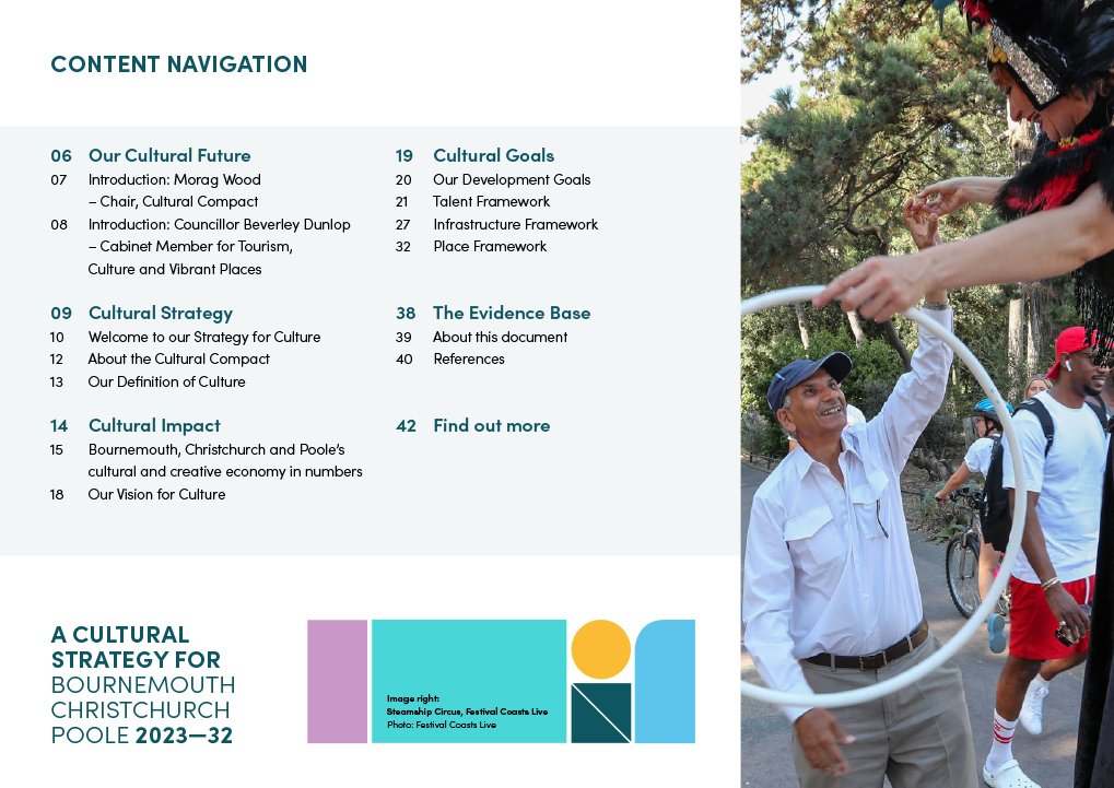
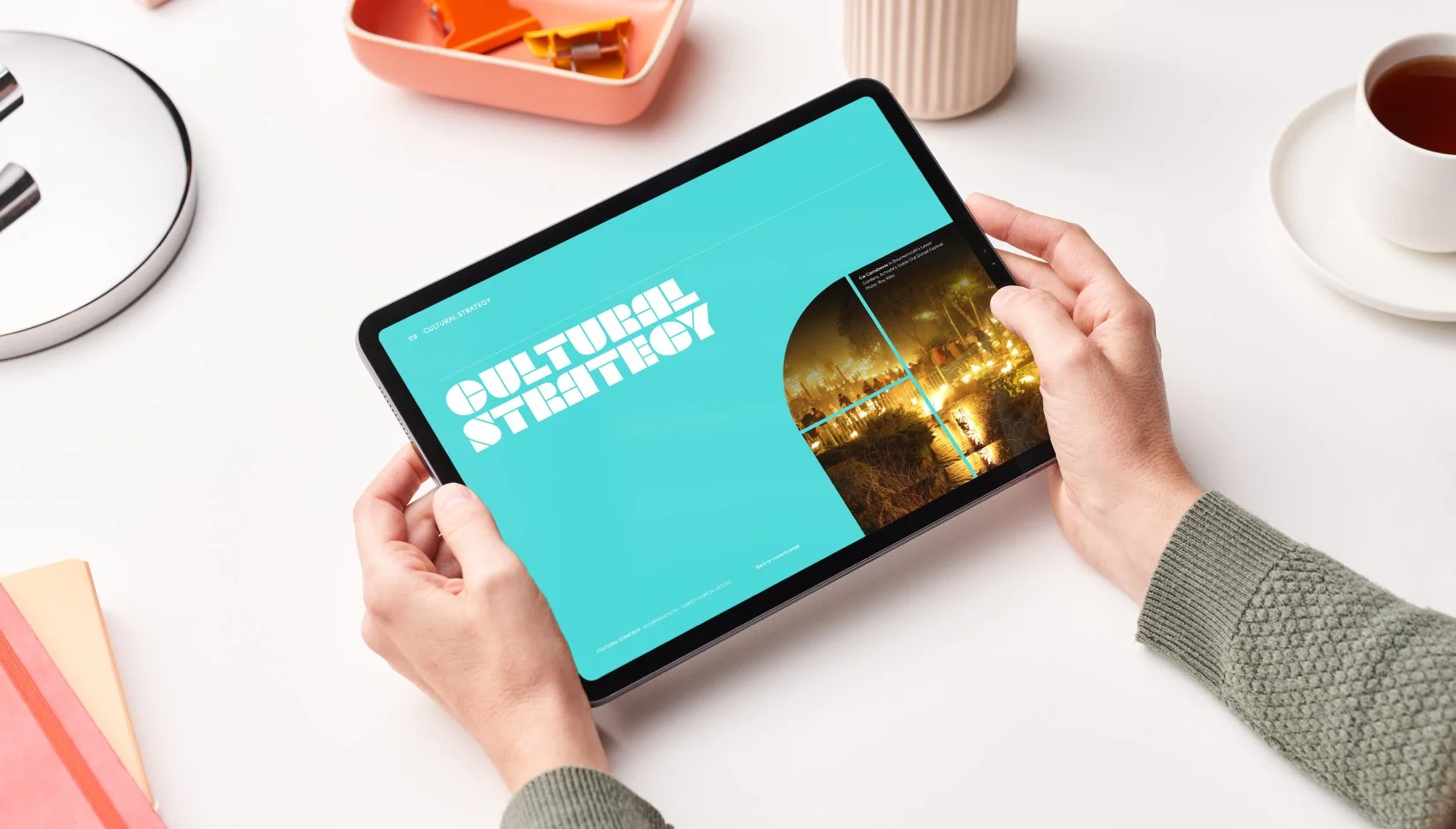
As a dynamic PDF, the document could easily be hosted online and be shared. It contained navigation and external links, allowing the user to easily skip through the document and reach areas of particular interest.

L&F combine solid branding design and creative direction with a calm and friendly competence that makes the team a pleasure to deal with. We were able hit the ground running with this project, realising it in a relatively short period of time. What L&F created was absolutely on point, allowing all partners to buy-in instantly. We have received huge praise for the document and we are incredibly proud of it.
Morag Wood
Culture Communications Collective
Recognition
Image credits
James Baker
James Bridle
Mike Petitdemange
Elliot Franks
Scott Salt
Roy Riley
Jacek Dzitkowski
Corin Messer
Where next? Activate Performing Arts | Recipero | Muddy Little Boots Publishing