

Perry Bishop
Established in 2000, Perry Bishop is an award-winning property group with a reputation for excellence, local knowledge and personal service. With a network of offices in the Cotswolds and surrounding areas, the expert team specialise in simplifying the property process for clients looking to buy, sell or rent their homes.
THE CHALLENGE
The property market is changing. New developments throughout the Cotswolds are attracting buyers from outside the local area who don’t recognise the value – and decades of local knowledge – behind the Perry Bishop brand.
And with growing competition from well-known national agents – as well as smaller companies with a more dynamic approach to marketing – Perry Bishop risked getting left behind.
It was time for a rebrand.
THE SOLUTION
Rebranding a business with a 20+ year heritage is a balancing act: an evolution, rather than a fresh start.
Driven by a need to compete with national chains, attract a younger audience, and reposition Perry Bishop for the next decade, the project demanded a clear, customer-focused proposition and a fresh new look and feel.
We began with an in-depth discovery phase – gathering and analysing client and stakeholder feedback about the brand’s current image and market perception. As well as helping to ensure engagement and vital buy-in from the team, discovery enables us to establish what’s working, and what’s not.
The valuable insight gained from this initial phase helped us unite Perry Bishop behind the idea of a core story: one of support, reassurance and proven results. A story that takes the legacy of an established business and presents it in a brand-new way. Homes are where families grow, and life stories unfold – and therefore property is about life: an emotional journey that requires a trusted guide.
While other agents focus on property, Perry Bishop would focus on people.

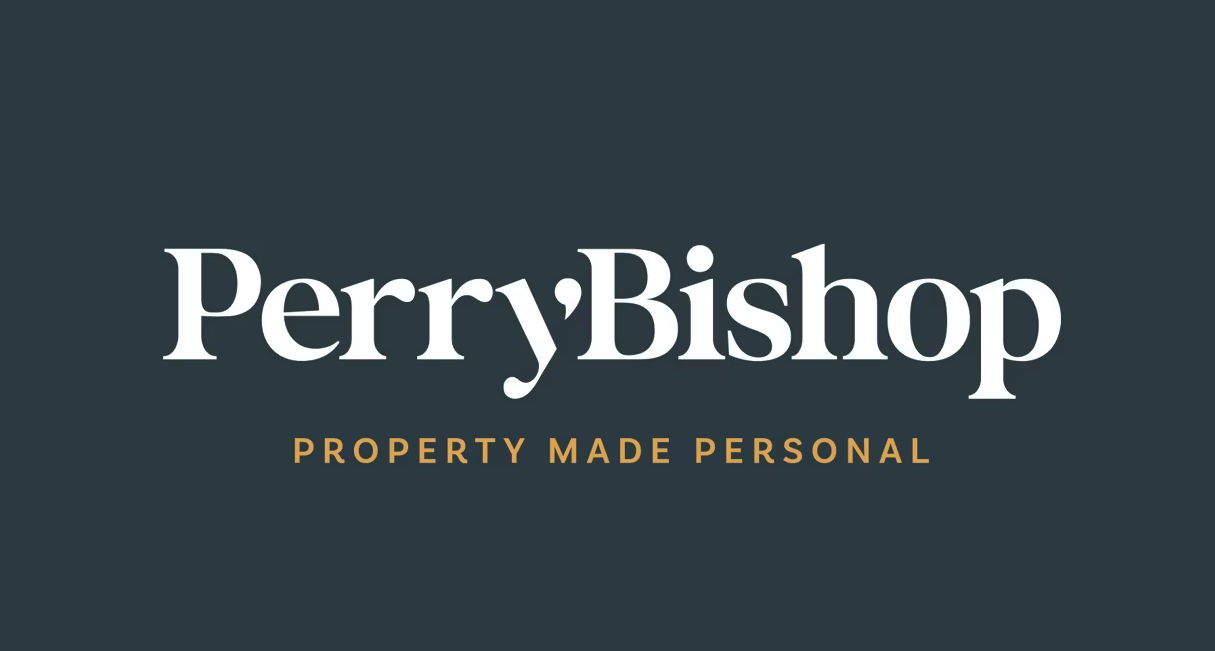

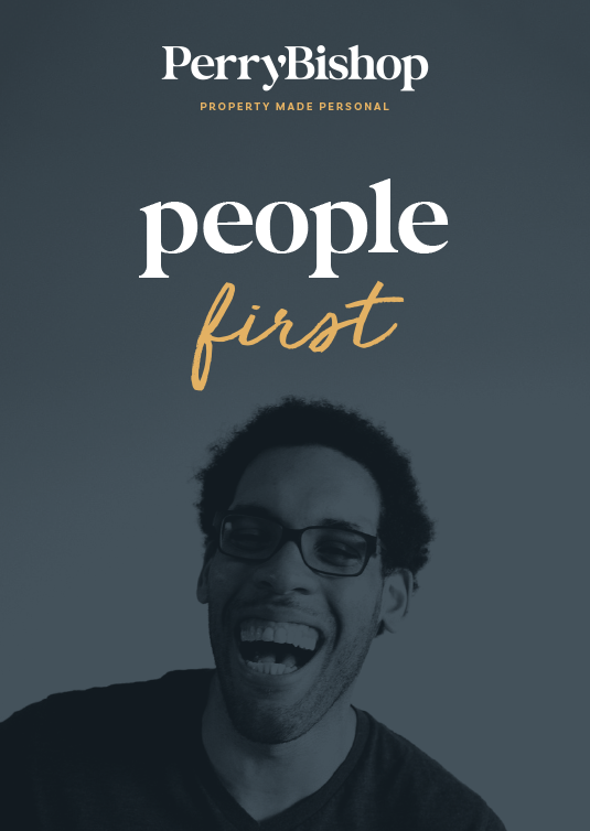
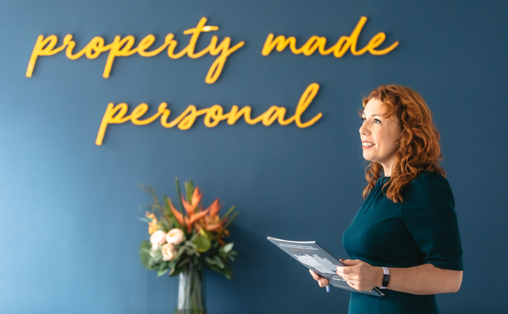
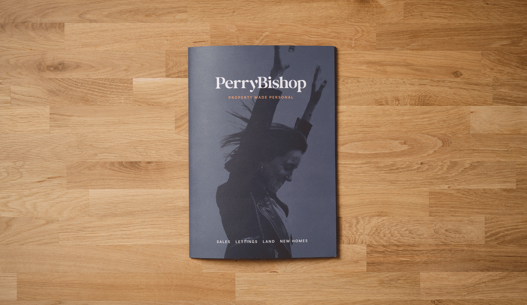
Property made personal
Developing a ‘people first’ philosophy cemented the idea that it is relationships, not houses, that are pivotal to the ongoing success of the business.
The property sector may not be known for excellent personal service, but Perry Bishop has always supported clients every step of the way – and prides itself on making the property process as enjoyable and stress-free as possible.
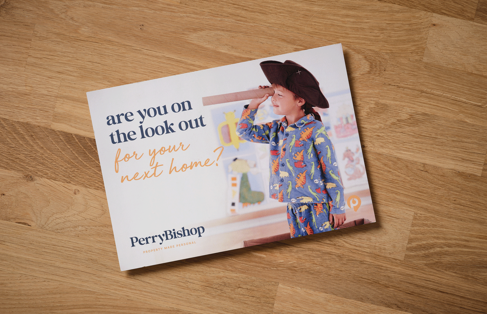
The rebrand communicates this caring, individual approach through creative brand assets and customer-focused, outcome-driven messaging across the board.
WHAT WE DELIVERED
Taking a collaborative approach to the project – and involving our trusted partners where necessary – we developed an upbeat, aspirational look and feel with new fonts and logotype and complete brand guidelines to support its implementation.
And because brand isn’t just skin-deep, we created a new, more approachable tone of voice that embraces the company’s personality.
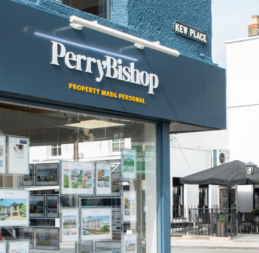
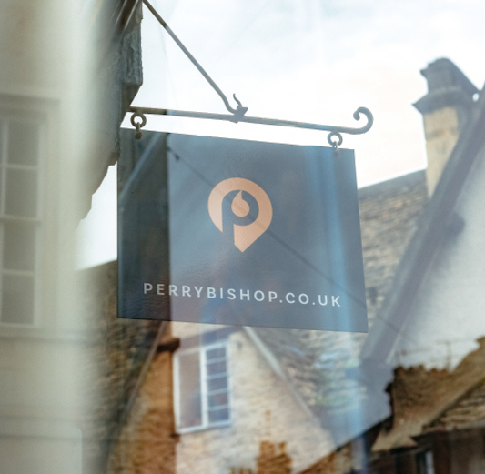
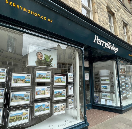
We worked closely with Perry Bishop’s install team to ensure brand consistency across a range of applications – from painted walls to acrylic signs, digital and print media. And we collaborated with a specialist property web company to ensure the application of the new brand, streamlined navigation and a clearer, more focused message throughout the website (as well as linking up with Rightmove databases).
The rebrand has already been reflected in a vast range of marketing and brand assets, including:


L&F are terrific to work with. Andy and the team have known our business for a few years and had a good understanding of our offering. We initially spoke to their brand strategist to develop our direction of travel.
L&F weren’t afraid to challenge our thinking. While we didn’t always appreciate it at the time, this prevented a compromised and diluted rebrand.
Our new look is tremendous and achieves everything we set out to do, and more. It positions us brilliantly for our next stage of development.
A job done really well!
Phillip Bishop
Managing Director, Perry Bishop
Recognition
Image credits
Suggested projects: The Country House Surveying Co. | Genus Gardener | A Year in a Cottage Garden