

Recipero
Branding a pioneering, UK-based data intelligence organisation.
THE CLIENT
Recipero is a privately owned UK tech company working at the intersection of identity, ownership, and data. Since 1999, they've been developing device-led intelligence solutions that help reduce crime, prevent fraud, and support safer, more informed decision-making across the world’s mobile device and valued article markets.
From trade-ins and insurance claims to loss reports and police investigations, Receipero technology underpins millions of real-world decisions every year. Whether through direct platforms or integrated APIs, their technical services support law enforcement, wireless networks, insurers, recyclers, retailers, and the public.
THE CHALLENGE
Data intelligence can be perceived to be incredibly technical, complex and generally hard to understand. Visually, this industry is challenging to represent and hard for the audience to understand and engage with. The current Recipero brand offered little in terms of personality and showed little regarding the people and experiences behind the technology. Our challenge was to rebrand this organisation in such a way that it felt established and iconic, yet relatable and approachable. We needed to humanise the offering and service.
Our consideration was the evolution of the brand rather revolution. The new brand shouldn’t feel like a new start-up or even a company under new ownership; what we needed to deliver was “next generation” Recipero.

THE SOLUTION
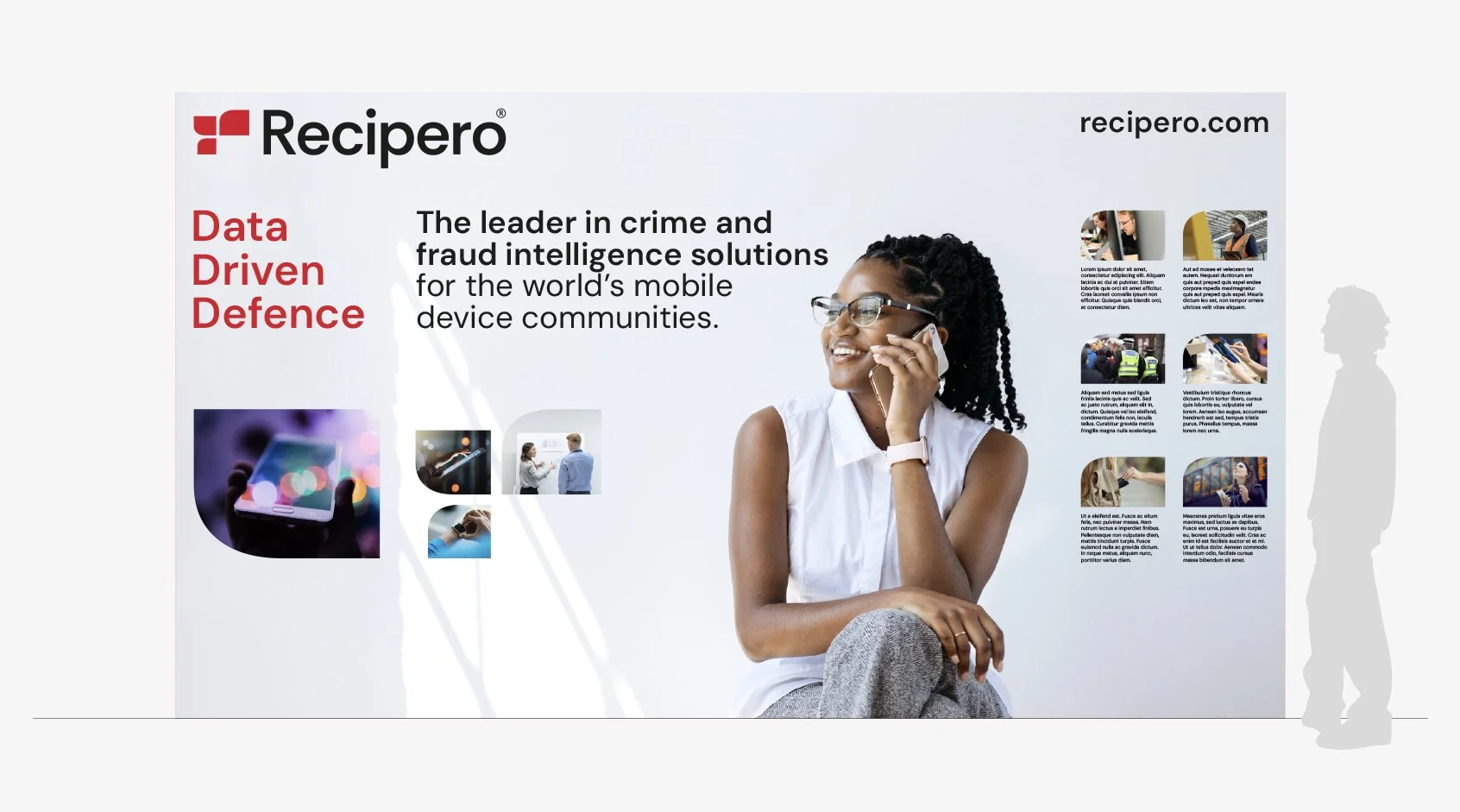
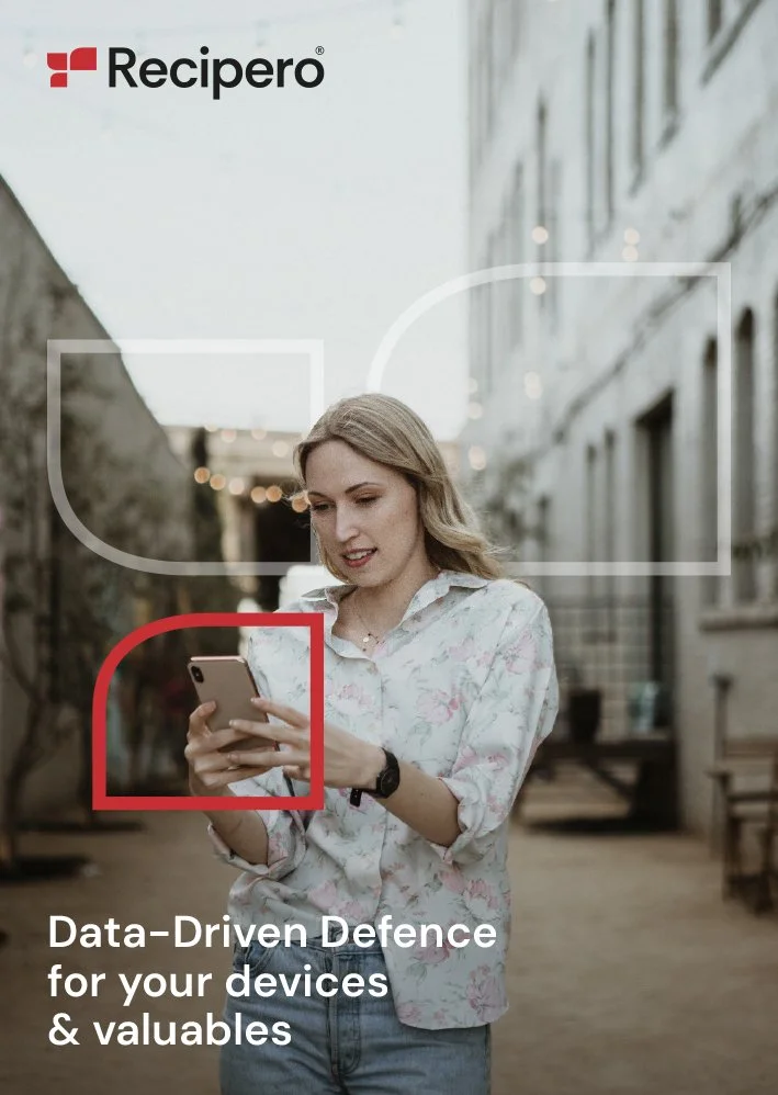
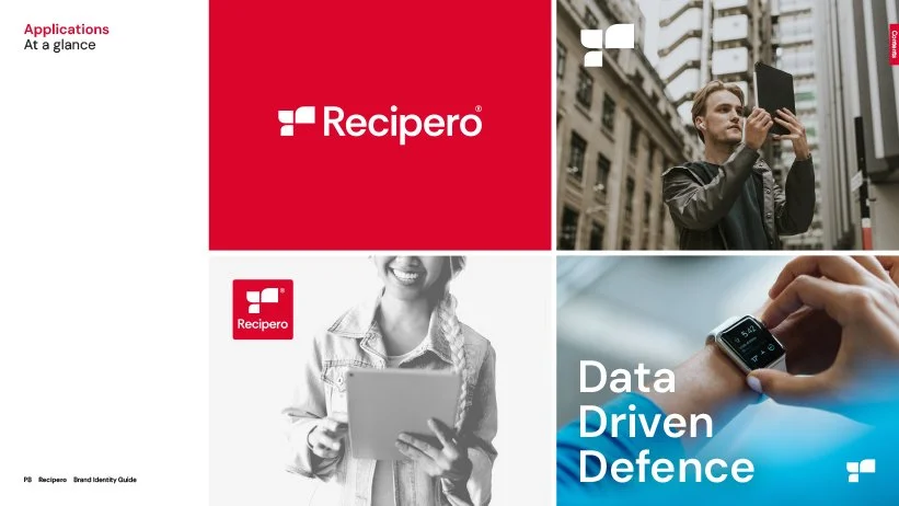
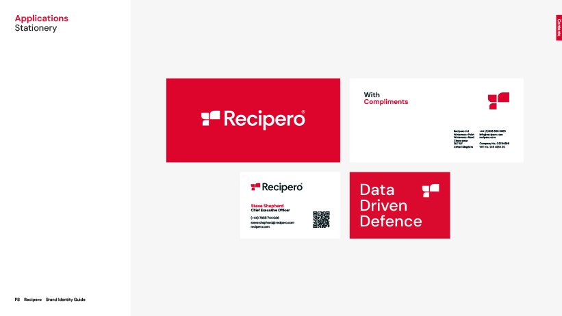
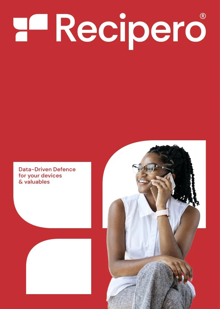
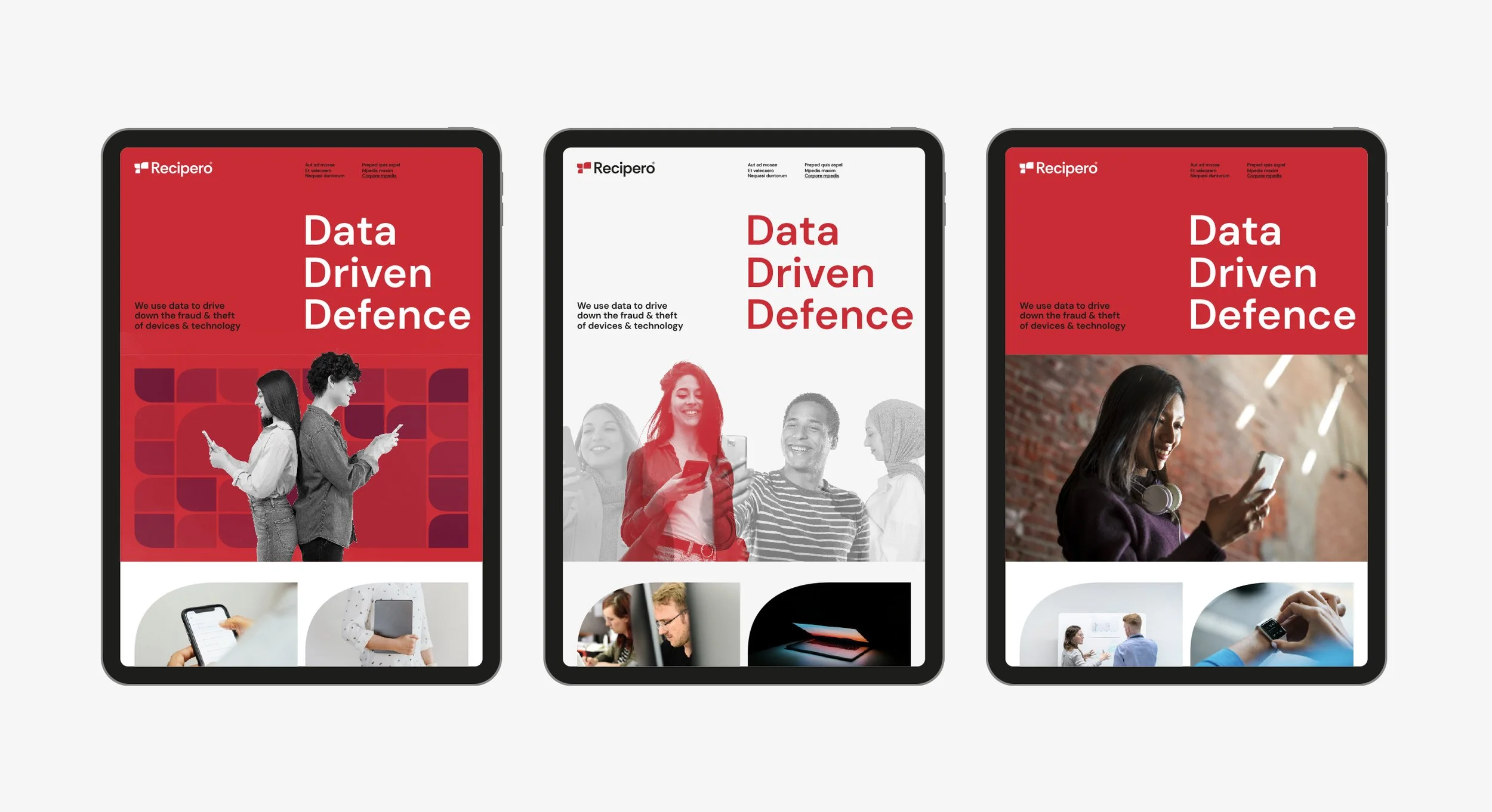
We decided to retain the previous Recipero brand colour but beyond that delivered a completely new typographic brand identity and visual language. The the new brand is big, bold and typographic, exploring a more accessible tone of voice. The strapline “Data Driven Defence” encapsulates everything that Recipero is and does and sets the platform for the new brand voice.
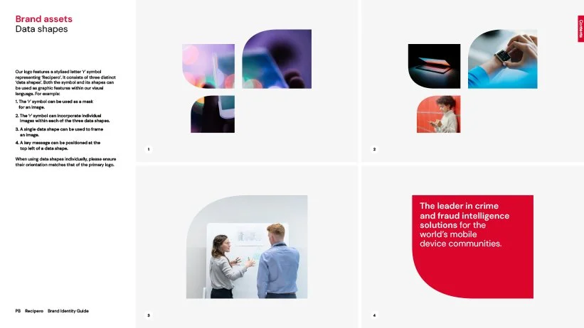
An iconic R was created to represent data flow and communication. This new brand symbol offered the opportunity to explore a whole new way of displaying information and imagery graphically. Simple, easy to apply, yet dynamic and modern. The new graphic shape can also be used as a cropping device for images or in outline (frame) form, helping to highlight elements like a viewfinder.
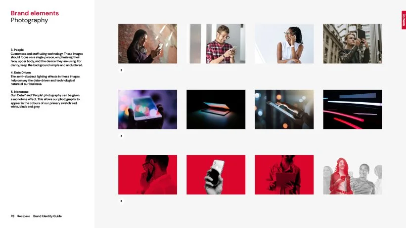
The new approach to imagery was fundamental to the success of this project. Recipero needed to be relatable and believable. Their audience needed to see themselves and their experiences within Recipero communications. Recipero also needed to be clearly UK-based. Whilst utlising a new approach to stock imagery, exploring UK-based foundries, we also commissioned bespoke case study photography to set the visual platform for the future.


Brand platform
Distilling the Recipero offer was fundamental to the impact of this brand. Their strapline provides an engaging, all-encompassing summary of what they do.
As part of the process we also reviewed the complete brand platform covering purpose, positioning, values, and voice.
WHAT WE DELIVERED
Our brief was to deliver a new brand identity, graphic system and brand platform. Recipero have a knowledgeable and skilful in-house team who are able to create day-to-day communications both in print and online.
We delivered a comprehensive brand guidelines that, whilst offering guidance, also inspires the in-house team to further develop the brand for years to come.
We continue our role as brand guardians and offer strategic advice and guidance for key deliverables and projects. We are incredibly proud and invested in the new brand and regularly offer free consultations with the Recipero team to ensure that the brand doesn’t stagnate and evolves in the right manner.

Andy and the wider L&F team are a delight to work with. They ask intelligent questions and aren’t afraid to challenge us and to be challenged in return. What they delivered within the timeframe and budget exceeded our expectations. The brand they delivered, and the supporting brand guidelines, is extremely comprehensive and the Recipero team just love working with it. We always know they are on the end of the phone should we have any questions, and we regularly check-in to ensure the Recipero brand continues on the right path. The feedback from our clients to date has been extremely positive. Thank you.
Allister Beech
Head of UX & Marketing Design, Recipero
Recognition
Matt Jolly
Phill Southgate
Image credits
Suggested projects: Genus Gardenwear | Tide Insurance | Elevate Interior Solutions